
- The mural crown shows nine visible towers, while, by a standard inherited from Portuguese settlers, a city should use a mural crown with five visible towers.
- Being Natal the capital city of Rio Grande do Norte, this mural crown should be golden, in recognition of this special status.
- The coat of arms is placed in a English shield shape, while a Spanish escutcheon should be rather used.
The obvious solution is a banner of the coat of arms but where would the fun be in that?
Leonardo's design simply corrects these errors:

designed by Leonardo Piccioni
I have taken this further and made a couple of new designs. The first designs feature both a simple version of the arms showing only the shield and a version with the full coat of arms.
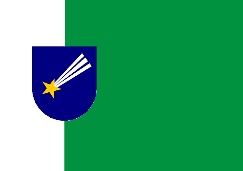
The first one takes the colours of the current flag and forms a green and white vertical field rather than horizontal with the arms at the hoist separating the two colours.

The next design really is based on the current flag with the arms moved towards the hoist which I think works better when the flag is in use than if they were in the centre.


The next flag is based on the American stars and bars flag. but with the bars changed to green and white and the banner of the coat of arms in the canton.

Again I took this one step further with moving the banner of Natal to where the white bar is and placeing the state flag in the canton. Now the state flag I used is not the official state flag but a proposed replacement designed by Leonardo. The reasons I used this are:
- In my opinion it is better than the current flag.
- It works better in my flag than what the current state flag does.

I also thought when making this why stop at state? Why not put the Brazil flag in?

The problem I have with this is that the Brazil flag is too complicated and the colours don't work, but this can easily be corrected.

In this design I simplified the Brazil flag by removing the stars and the text. and changed the blue in the field to match that in the canton. I did not change the green as I think it works better with too shades to make the canton stand out from the flag.
All designs are mine unless stated otherwise. Comments are appreciated. :)
I think the two versions with mural crown (1st and 3rd) are the best. Excellent ones!
ReplyDelete